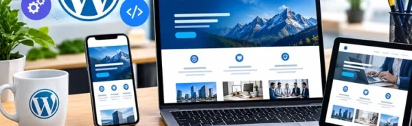
Mobile-Friendly Website Design for Every Customer
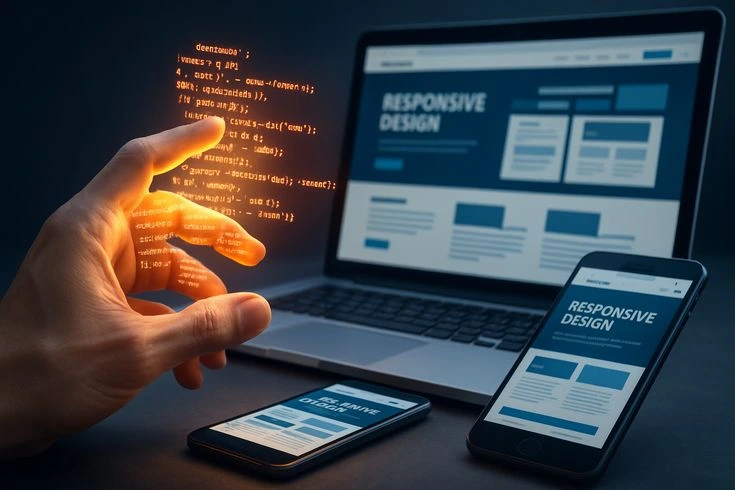
In today’s digital world, people use smartphones and tablets to search for products, explore services, compare businesses, and make purchasing decisions. Customers expect websites to work smoothly on every device, especially mobile phones. If your website is difficult to navigate, displays incorrectly, or takes too long to load on a smartphone, visitors may leave and choose a competitor instead.
This is why Mobile-Friendly Website Design has become an essential part of modern website development. A mobile-friendly website ensures that customers can easily access your business information, explore your services, and connect with you from any device.
At Dolphin Advertisers, we understand the importance of creating responsive, user-friendly, and professional websites that provide a smooth browsing experience for every customer.
What Is Mobile-Friendly Website Design?
Mobile-Friendly Website Design refers to creating a website that works properly on smartphones, tablets, laptops, and desktop computers.
A mobile-friendly website automatically adjusts its layout, images, text, and navigation according to the visitor’s screen size. This allows users to explore website content without constantly zooming in, scrolling horizontally, or struggling to find important information.
Responsive website design makes it possible to maintain a consistent and professional appearance across different screen sizes.
Whether a customer visits your website using an Android phone, an iPhone, a tablet, or a computer, the website should provide an easy and comfortable browsing experience.
Why Does Your Business Need a Mobile-Friendly Website?
Having a mobile-friendly website is important for businesses that want to reach more customers and establish a strong online presence.
Here are some important reasons why responsive website design matters.
1. Better User Experience for Every Customer
Customer experience plays an important role in the success of a website. Visitors should be able to find information, explore services, and navigate different pages without difficulty.
A responsive website provides readable text, properly arranged sections, easy navigation, and accessible buttons.
When customers can use your website comfortably on their mobile devices, they are more likely to explore your business and interact with your services.
2. Reach More Mobile Users
Many people search for local businesses, products, and professional services using their smartphones.
If your website is not optimized for mobile devices, you may create unnecessary difficulties for potential customers.
A mobile-responsive website helps your business connect with visitors across different devices and makes your services more accessible to a wider audience.
3. Improve Google Search Visibility
Mobile usability is an important consideration in Google’s search systems. Google primarily uses the mobile version of website content for indexing and ranking.
A properly developed mobile-friendly website helps ensure that important content is accessible and provides a better experience for mobile visitors.
Combined with effective SEO practices, responsive web design can support your website’s visibility in relevant search results.
However, responsive design alone does not guarantee higher Google rankings. Website quality, content relevance, performance, and other SEO factors also matter.
4. Faster and Smoother Website Performance
Website loading speed directly affects how visitors interact with your business.
Large images, unnecessary scripts, excessive plugins, and poorly optimized website elements can slow down your website, especially on mobile devices.
Professional mobile-friendly website development considers:
- Image compression and optimization.
- Lightweight website themes.
- Efficient website code.
- Proper caching configuration.
- Optimized plugins and scripts.
- Reliable website hosting.
These improvements can help your website load more efficiently and provide a smoother experience for visitors.
5. Easy Navigation on Small Screens
A desktop website layout does not always work properly on a smartphone.
Small buttons, crowded menus, and difficult navigation can frustrate mobile users.
Responsive website design addresses these issues by providing mobile-friendly menus, properly spaced buttons, readable content, and organized website sections.
Customers should be able to find your contact information, explore your services, and submit inquiries without unnecessary effort.
6. Build Customer Trust and Business Credibility
Your website represents your business online. A professional and mobile-responsive design creates a positive impression and helps visitors understand that your business values quality and customer experience.
An outdated or poorly displayed website may make your business appear less professional.
A modern, attractive, and responsive website helps establish credibility and encourages visitors to learn more about your products and services.
Important Features of a Mobile-Responsive Website
A professionally developed mobile-friendly website should include several important features.
Responsive Layout: Website sections automatically adjust to different screen sizes.
Readable Typography: Text remains clear and comfortable to read on smartphones and tablets.
Mobile-Friendly Navigation: Menus are simple, organized, and easy to access.
Optimized Images: Images display correctly without unnecessarily affecting loading speed.
Accessible Contact Buttons: Phone numbers, WhatsApp links, and inquiry buttons are easy to find and use.
Fast Loading Pages: Optimized website elements help reduce unnecessary loading delays.
Consistent Design: Your website maintains a professional appearance across different devices.
These features help create a convenient browsing experience for customers regardless of the device they use.
How WordPress Helps Create Mobile-Friendly Websites
WordPress is a popular platform for developing professional and responsive business websites.
With WordPress Website Development, businesses can benefit from flexible design options, easy content management, and responsive website layouts.
Using suitable WordPress themes and tools such as Elementor, developers can create customized website designs that adapt to different screen sizes.
Business owners can also manage website content, update images, publish blogs, and make basic changes through an easy-to-use dashboard.
However, choosing a responsive theme is only one part of the process. Proper development and testing are necessary to ensure that all website elements work correctly on mobile devices.
Why Choose Dolphin Advertisers for Responsive Website Design?
At Dolphin Advertisers, we believe every customer deserves a smooth and professional online experience.
Our Website Design and Development services focus on creating modern, responsive, and user-friendly websites that help businesses build a stronger digital presence.
We provide:
- Professional WordPress Website Design and Development.
- Mobile-Friendly and Responsive Website Layouts.
- Elementor-Based Website Development.
- User-Friendly Website Navigation.
- Website Speed Optimization.
- Basic On-Page SEO Optimization.
- Contact Forms and WhatsApp Integration.
- Google Maps Integration.
- Easy-to-Manage WordPress Dashboards.
Whether you are starting a new business or upgrading an existing website, we can help you develop a website that works across different devices and supports your business requirements.
Conclusion
A mobile-friendly website is no longer just an additional feature; it is an essential part of a successful online business.
Customers expect websites to load efficiently, display correctly, and provide easy navigation on smartphones, tablets, and computers.
Investing in Mobile-Friendly Website Design can help improve user experience, make your services more accessible, support your SEO efforts, and strengthen your business’s online presence.
Give your customers a better way to explore your business with a professional and responsive website.
Ready to Make Your Website Mobile-Friendly?